Branding: Difference between revisions
toc |
mNo edit summary |
||
| (11 intermediate revisions by 4 users not shown) | |||
| Line 12: | Line 12: | ||
The file linked to above is an SVG, which is vectored and will scale to any size you need. Nearly all imaging programs will accept it. | The file linked to above is an SVG, which is vectored and will scale to any size you need. Nearly all imaging programs will accept it. | ||
{{note|Wherever possible, please use this file.}} | {{note|Wherever possible, please use this file.}} | ||
==Fonts== | |||
{{main|Branding/Suggested fonts}} | |||
The font used for the H in the roundel is Bladi One Slab 4F Heavy. This is a commercial font available from [https://www.myfonts.com/fonts/4thfebruary/bladi-one-slab-4f/ myfonts] for £25. The font used for the Nottingham Hackspace text next to the roundel is Oxygen, a free font available from [https://fonts.google.com/specimen/Oxygen Google Fonts]. | The font used for the H in the roundel is Bladi One Slab 4F Heavy. This is a commercial font available from [https://www.myfonts.com/fonts/4thfebruary/bladi-one-slab-4f/ myfonts] for £25. The font used for the Nottingham Hackspace text next to the roundel is Oxygen, a free font available from [https://fonts.google.com/specimen/Oxygen Google Fonts]. | ||
| Line 20: | Line 23: | ||
There are plenty of variations of the Hackspace Logo in use. Below are some 'Hacked Logos' that you can use as a reference. | There are plenty of variations of the Hackspace Logo in use. Below are some 'Hacked Logos' that you can use as a reference. | ||
<gallery heights=200 mode=packed-hover> | <gallery heights=200 mode=packed-hover> | ||
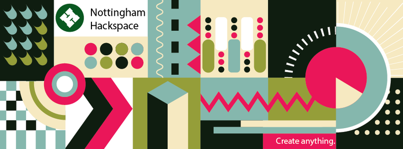
File:Facebook Banner.png|Facebook banner in the 2018/2019 styling | |||
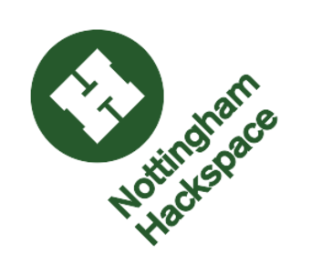
File:LogoVar1.svg|The slanted title logo | File:LogoVar1.svg|The slanted title logo | ||
File:WebsiteHeader.png|Website Header with alternate colour scheme | File:WebsiteHeader.png|Website Header with alternate colour scheme | ||
| Line 26: | Line 30: | ||
File:Branding QRCode.JPG|link=Media:Qrcode.pdf|QR Code that links to our website | File:Branding QRCode.JPG|link=Media:Qrcode.pdf|QR Code that links to our website | ||
File:HereLogo.svg|Waymarker used on maps | File:HereLogo.svg|Waymarker used on maps | ||
File:Video Logo Transparent.png|Transparent Background Video Logo, Has white text to the right that reads "Nottingham Hackspace" | |||
File:Banner.jpg|Old Logo from when were located at the Art Org | |||
File:Wide nottinghack background.jpg|Desktop wallpaper | |||
File:Pride Logo.jpg|Nottinghack pride logo | |||
</gallery> | </gallery> | ||
| Line 66: | Line 74: | ||
==See Also== | ==See Also== | ||
Related to Branding is the [[Promotional materials]], it includes files for some of the different posters and announcements we've used in the past. | Related to Branding is the [[Promotional materials]], it includes files for some of the different posters and announcements we've used in the past. | ||
* [[Team:Communications]] | |||
[[Category:Marketing]] | [[Category:Marketing]] | ||
[[Category:Design and graphics]] | [[Category:Design and graphics]] | ||
[[Category:About]] | [[Category:About]] | ||
[[Category:Communications]] | |||
Latest revision as of 14:34, 2 June 2021
- See also: Promotional materials
| Overview |
|---|
|
| The Space • Location • New Members • Tools • Events • Teams • Projects |
| Volunteering • Infrastructure • Network • Members • Action List • Donations Pledge Drives • Meeting • Financials Branding • Suppliers • History |
Our logo is a white, angled, H in a green circle. It is ubiquitous in the space and can be seen on everything from Leaflets, Walls and T-shirts. The logo must always be represented in Green, with the exception of items printed as Black and White. It is also acceptable to use the logo as an inversion, whereby the H itself and the background is green, as per the Nottinghack Website
-
Official Nottinghack Logo
The file linked to above is an SVG, which is vectored and will scale to any size you need. Nearly all imaging programs will accept it.
Fonts
- Main article: Branding/Suggested fonts
The font used for the H in the roundel is Bladi One Slab 4F Heavy. This is a commercial font available from myfonts for £25. The font used for the Nottingham Hackspace text next to the roundel is Oxygen, a free font available from Google Fonts.
Hacked Logos
Although we have brand guidelines, the way we represent the Hackspace in Promotional materials and online is very relaxed. Modifying the Hackspace Logo to fit your needs is OK. As we are a hackspace, we encourage people to have a go at things themselves. Our logo is no exception. All we ask is that you try and keep the H and circle the same, and keep it the same green. Beyond that, it is up to you to make it your own.
There are plenty of variations of the Hackspace Logo in use. Below are some 'Hacked Logos' that you can use as a reference.
-
Facebook banner in the 2018/2019 styling
-
The slanted title logo
-
Website Header with alternate colour scheme
-
Warning! Hacking in progress!
-
Hack Arrows - Used around the building to direct people to the hackspace
-
QR Code that links to our website
-
Waymarker used on maps
-
Transparent Background Video Logo, Has white text to the right that reads "Nottingham Hackspace"
-
Old Logo from when were located at the Art Org
-
Desktop wallpaper
-
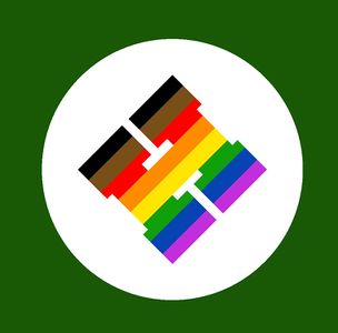
Nottinghack pride logo
Hackspace Green
The official green colour is Lincoln Green which is measured as the following -
| Lincoln Green | ||||
|---|---|---|---|---|
| CMYK
(For Print) |
C | M | Y | K |
| 72 | 0 | 94 | 65 | |
| RGB
(For Screen) |
R | G | B | |
| 25 | 89 | 5 | ||
| RGB Hex | #195905 | |||
| RAL
(For Paint) |
6002 | |||
See Also
Related to Branding is the Promotional materials, it includes files for some of the different posters and announcements we've used in the past.

